It's true. Transparency can cause your app major problems. You know what's the worst? Apps that freeze up, especially when scrolling. If you want a great user experience then you want great graphics performance. Enter transparency. There are some simple ways to optimize your layouts in order to improve graphics performance. Because what you don't want is a huge hierarchy of nested views with transparent backgrounds, layered on top over each other over and over again, all in a massive UICollectionView with tons of networking requests going on.
Individually, none of those things are bad. Transparency? Noice. Fresh data? Good. Beautiful UI? Yeah.
However, with iOS 7, iOS 8, and Yosemite's dive into the use of blurs and transparency in the quest for Clarity, Deference, and Depth come decisions and tradeoffs to be made in the implementation of our apps.
The first thing is to understand a little about compositing. When it comes to motion pictures compositing involves combining visual elements from separate sources into a final image (or sequence of images). Think green screens.
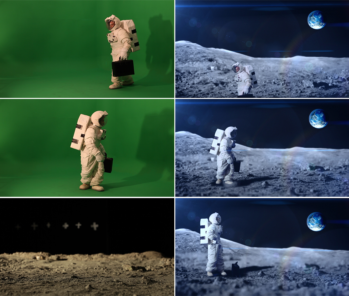
In a mathematical sense one of the basic operations of compositing is referred to as alpha blending. Consider two images placed on top of each other, the foreground image with an alpha level of 0.5. Compositing occurs by mathematically combining information about both images and generating a third, composited image.
In iOS it's very common to set a view's alpha property in order to gain a level of transparency. In combination with the use of blurs Apple has created stunning interfaces in the operating system itself and in Apple apps like FaceTime and Camera. And lots of great apps have followed suit. Tons. But here's the problem, it's not as simple as going in and setting some clear backgrounds. To create a great user interface and a smooth, fluid experience the use of blurs and transparency must be extremely calculated. It's easy to add some transparency, try it out on the simulator or your newish iPhone, and call it good. But will it hold up across all devices, OS versions, and when used in a UITableView containing dozens, or hundreds, of items?
Fortunately there are a few simple things that can be done to optimize graphics performance. These are the low hanging fruit, but can potentially make a huge difference.
- First, be conscious of using [UIColor clearColor]. It's not free!
- Declare views as opaque whenever and wherever possible. Have a UILabel with a clear background and colored text? If whatever's behind the label is a solid color, then rather than setting the background of the label to clear, set it to the appropriate color and set opaque to YES. This will prevent the need to blend the layers every time the view is rendered.
- This is a silly one, but if you have a button without text, make sure you remove all text and set the font color to default. There is no reason to set the text to clear color. None at all.
- Be aware of animating alpha changes, for example when asynchronously fetching images while scrolling a UITableView. The fade-in might look nice, but it can be costly. Consider a good placeholder image instead. If you take a look around (e.g. Facebook, Twitter, among others) you might notice that the fade-in is a little less common than you thought. I'm a big fan of Twitter's unobtrusive gray placeholder that switches to the image as soon as it's been downloaded and readied for display.
Okay, so transparency is not inherently evil, but it can lead your app to dark dark places. I've recently been taking a hard look at graphics performances in apps I'm working on and have been pleasantly surprised at the performance gains (errr, absence of performance issues) using said techniques.
Other suggestions:
- Use Instruments to measure your app's graphical performance
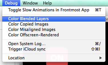
- Turn on "Color Blended Layers" in the iOS Simulator - you might be surprised at the places where the GPU is wasting precious computational cycles
Also recommended:
- ENSwiftSideMenu - Neat use of transparency and blurring in a side menu (and swiftalicious)
- UIView: Opaque vs Alpha - We've all googled it before
- UIImage+ImageEffects - UIImage category with blur and tint effects
- UIVisualEffectView - New API for creating visual effects in iOS 8